

Context
Timothy Marthand, a popular pianist, approached us to help him bring his vision of making music practice easier for students. He had a few screens designed that he wanted us to use as reference to create a mobile app. This is the story of how I assisted him in bringing his vision to life.
My Role
I took charge of designing the iOS app and led the UX efforts, handling all major deliverables and presenting them to the client.
The challenge - An app in 2 weeks
Our client approached us with two main objectives: enhancing their app's functionality, usability to align with modern design standards, and seeking quick assistance in product design. He wanted this to be done in two weeks so that he can quickly test this out in the market.
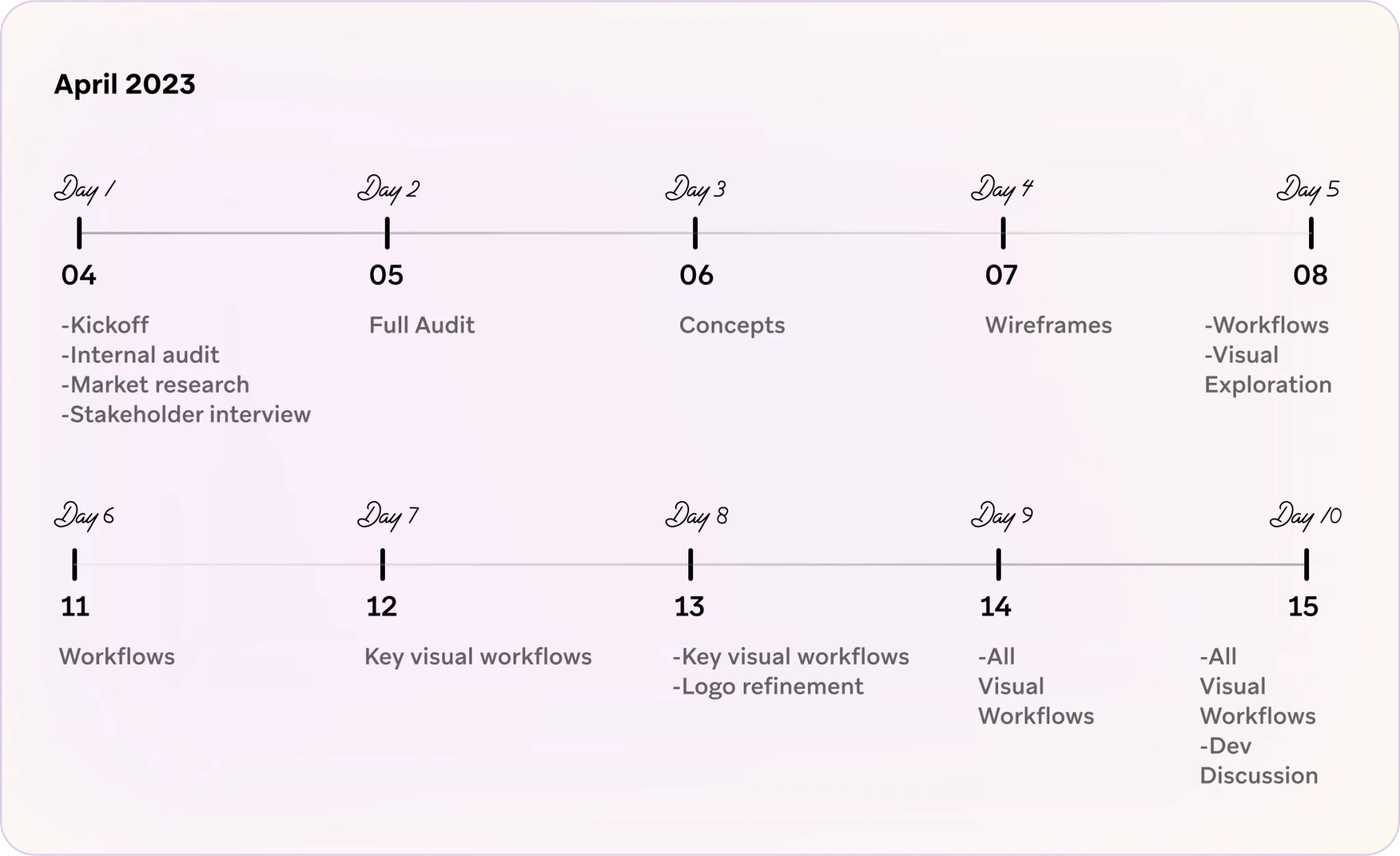
This is how the sprint timeline was looking like:
Discovery
The discovery phase was a quick, high‐intensity effort. We scheduled multiple calls with the client that allowed us to define project milestones, audit the existing work, understand our client's vision, and begin research into the core users and their needs.
Requirements
Here are the findings from our discussions with the stakeholders:
Students, aged between 6 and 14, are the primary users of the app, while instructors and parents serve as secondary users.
Students are experiencing delays in advancing to the next level due to insufficient practice following real-time sessions.
The current method of assigning practice tasks is inefficient, as tasks are shared on a WhatsApp group, making it challenging to personalise for individual students and monitor their progress later.
Instructors struggle to monitor students' practice habits, relying solely on verbal reports
Parents lack visibility into their children's performance.
The app should provide business metrics to accelerate students' learning of any instrument. Teachers will be able to monitor students' homework completion and facilitate quicker progress. However, word-of-mouth recommendations may not be quantifiable.
Each individual has a different learning pace, particularly in art. Therefore, assigning the same homework to all students when they reach a certain threshold is impractical. Managing and tracking data on WhatsApp for a large pool of students is cumbersome.
The current approach of sending homework assignments via WhatsApp and requesting students to record audio/video submissions on their phones leads to additional challenges in data management and tracking. These methods lack visual appeal and interactivity from the students' perspective.
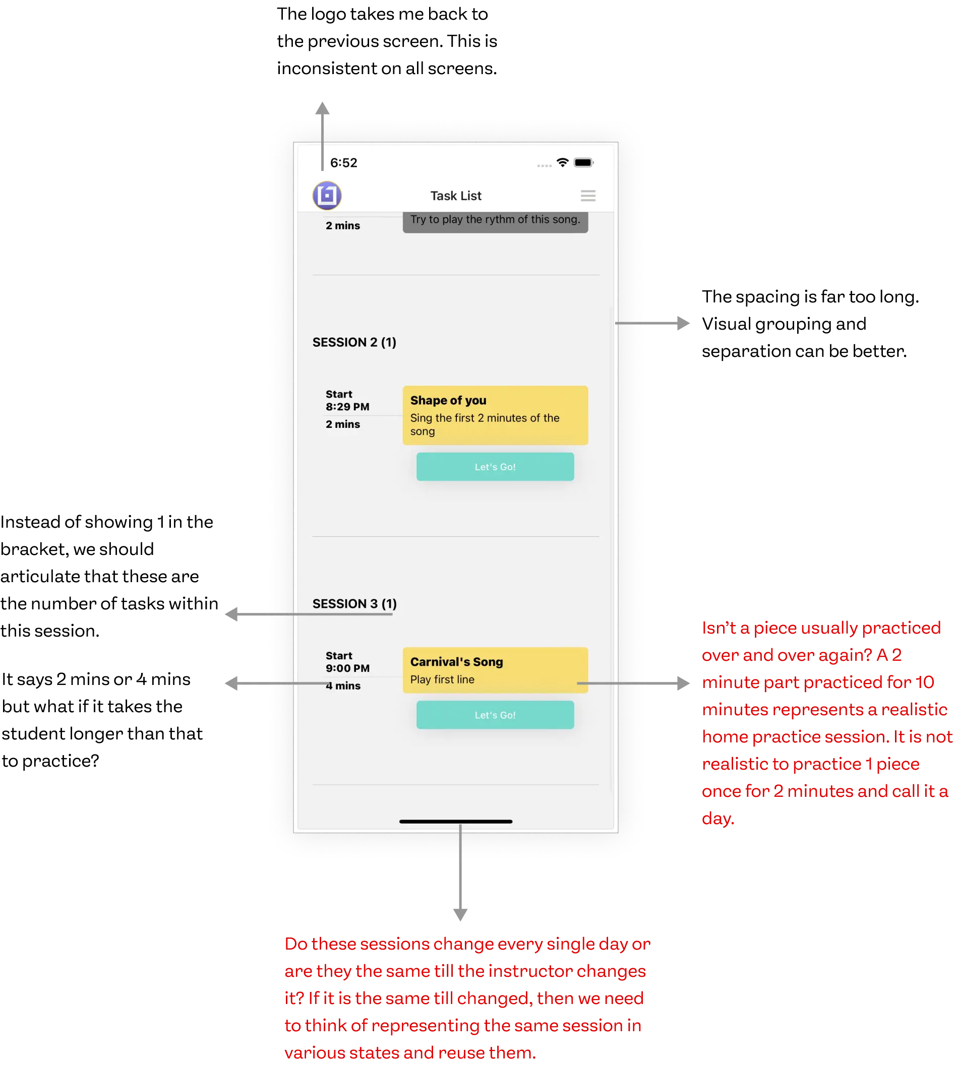
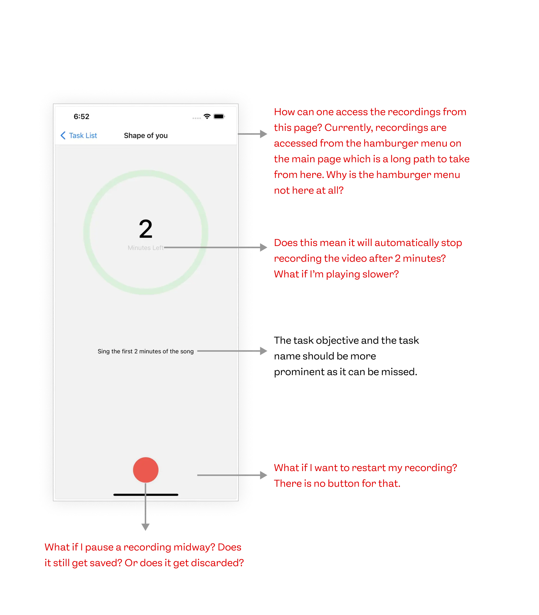
Auditing the existing app
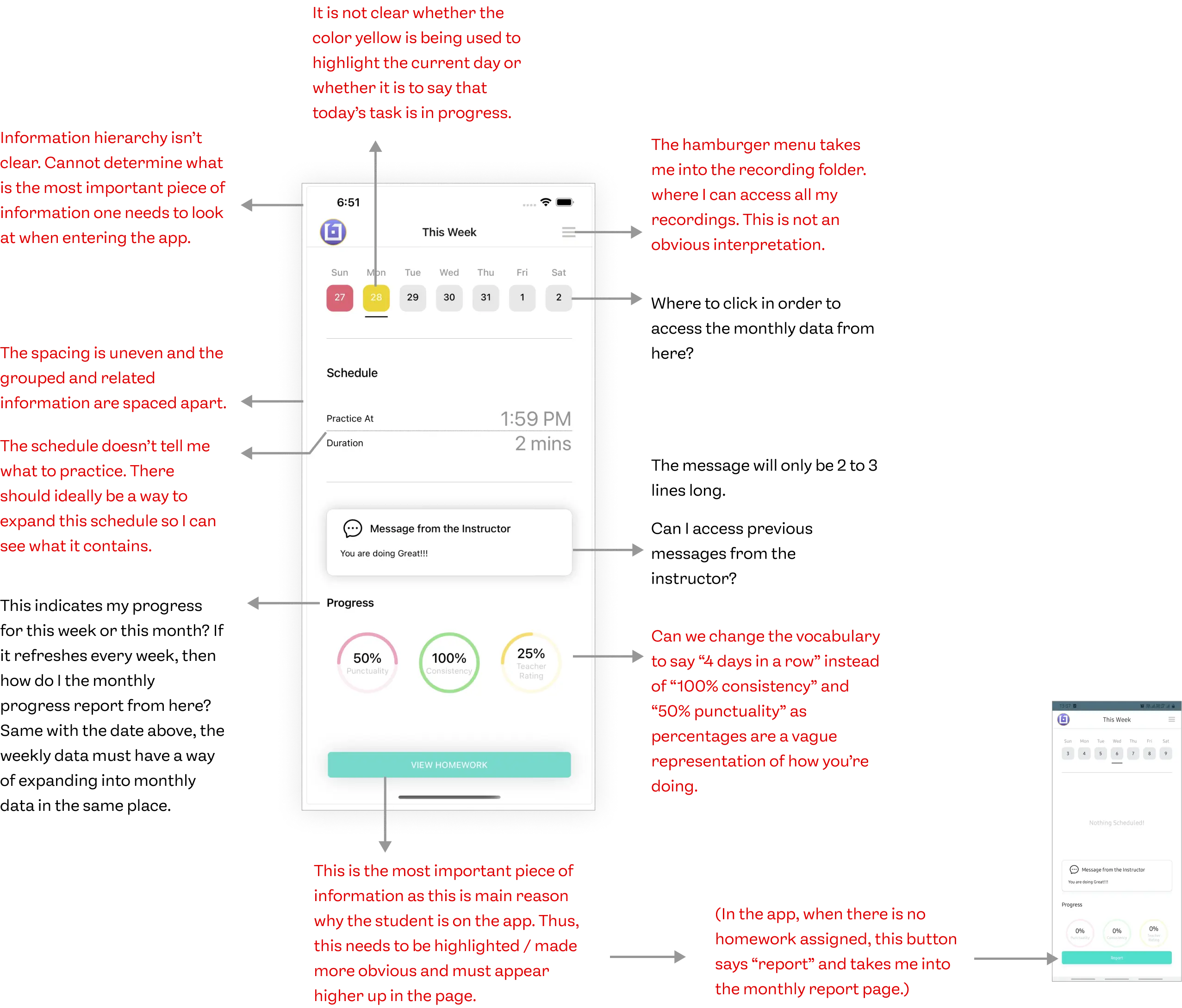
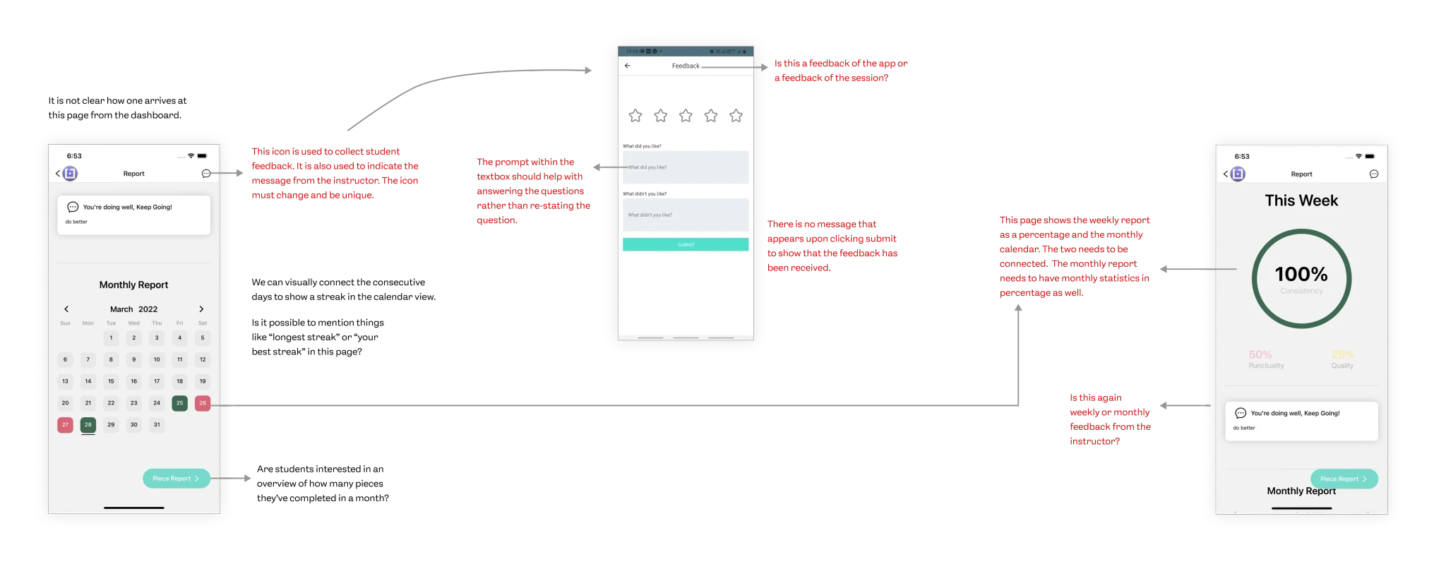


Visual
Brand Identification
Grouping
Alignment
Spacing
Color Mapping
Text Readability
Text Contrast
Interactions
Affordance
Feedback
Workflow
Transitions
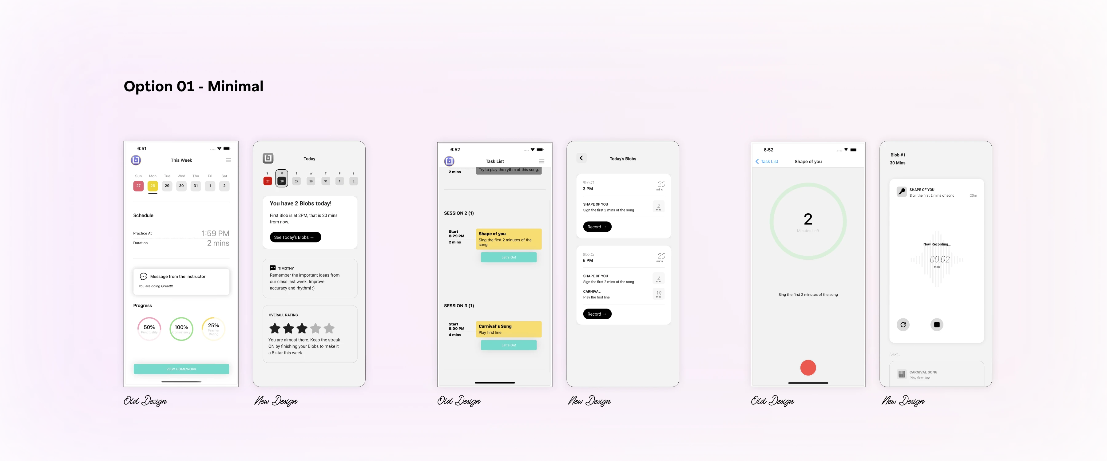
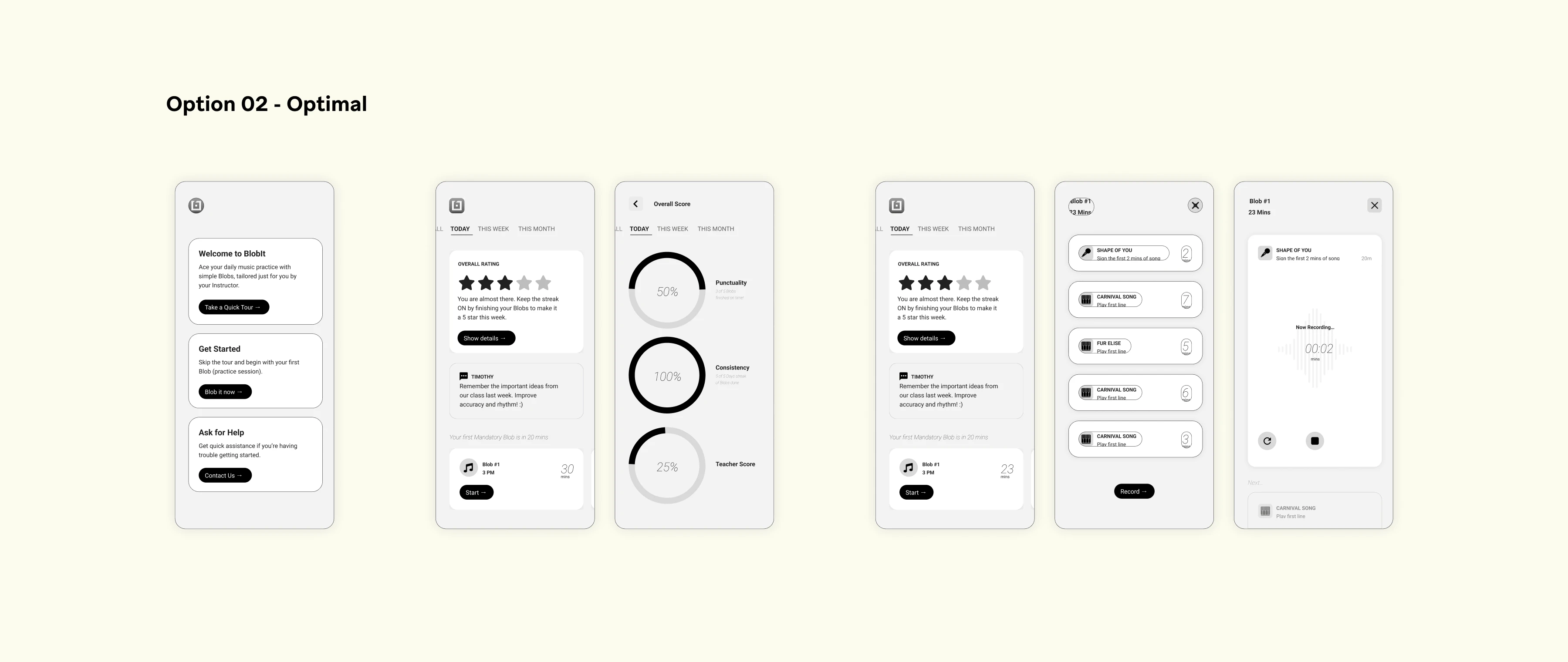
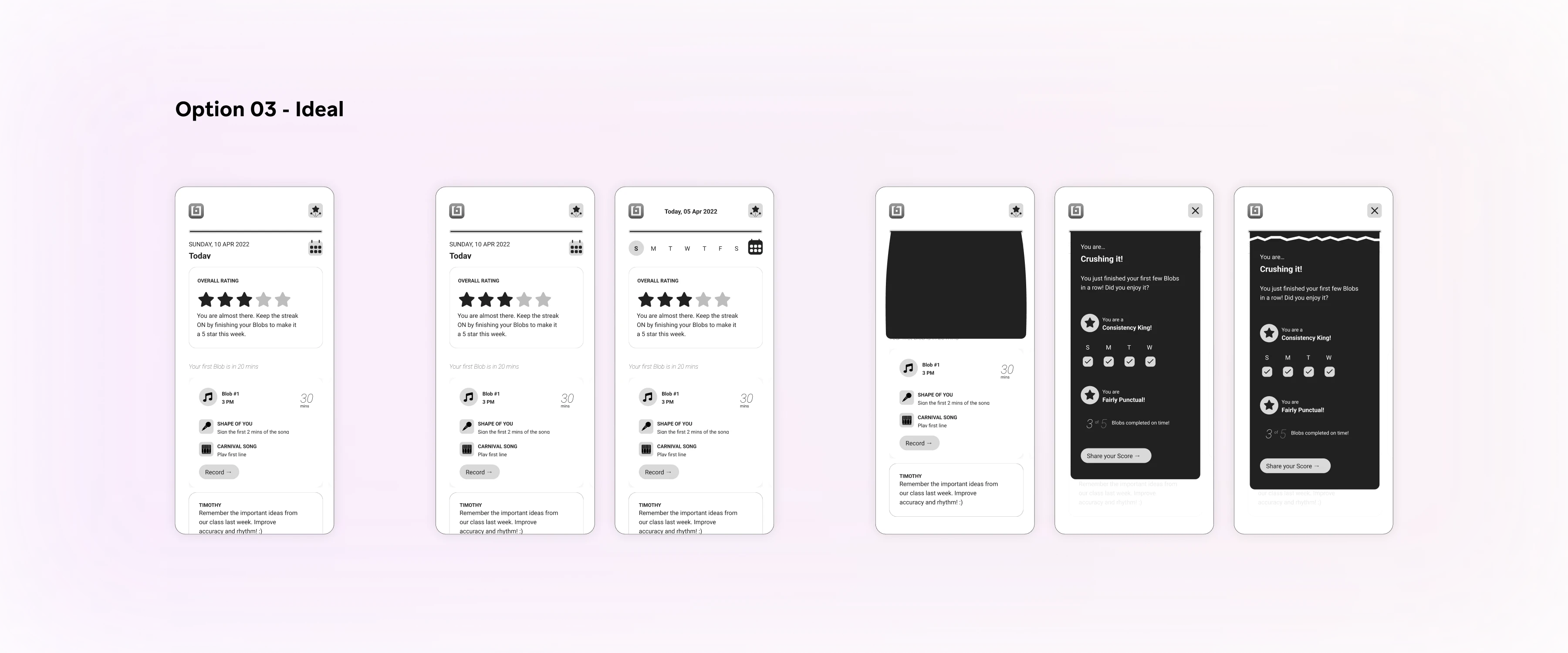
Options for design direction
Following a thorough audit of the app and a clear understanding of the client’s requirements, we proposed three tailored solutions. This approach empowered the client to make a well-informed decision, taking into account their time constraints and development resources. Ultimately, the client selected option 2, recognizing it as the most fitting choice.

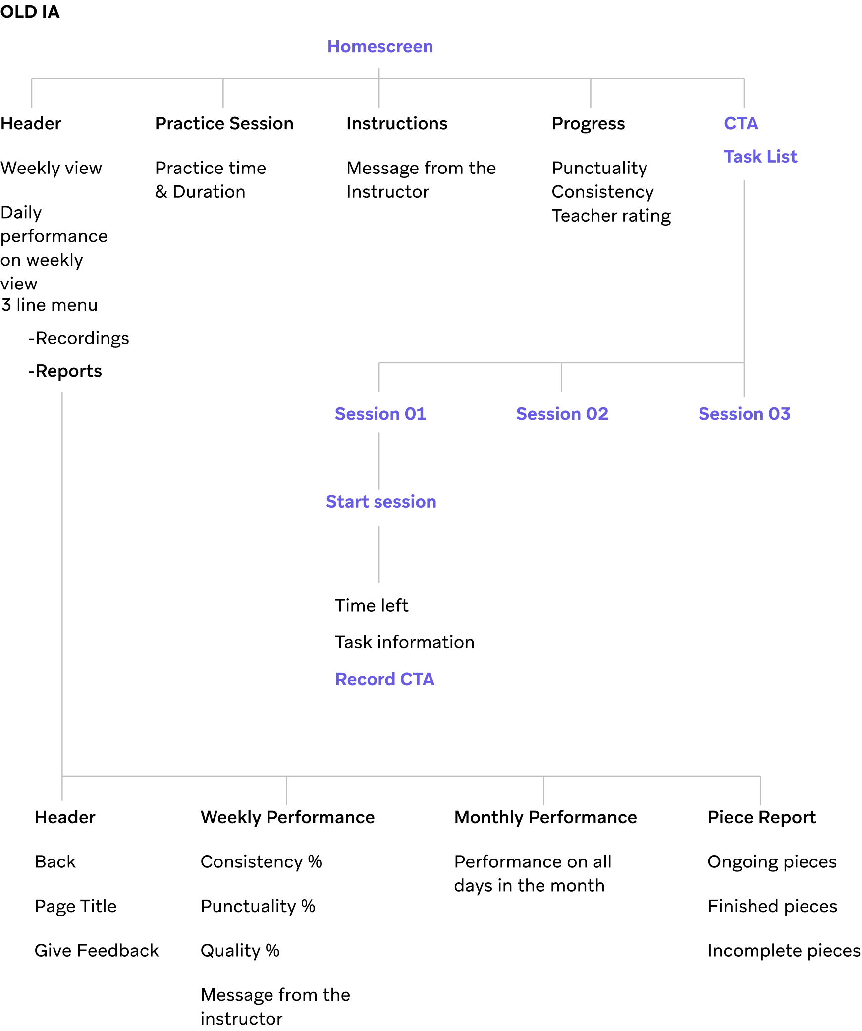
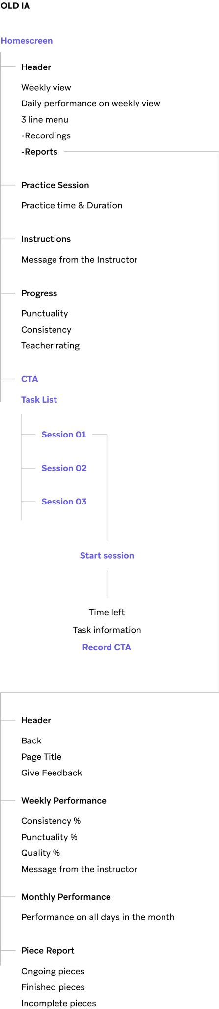
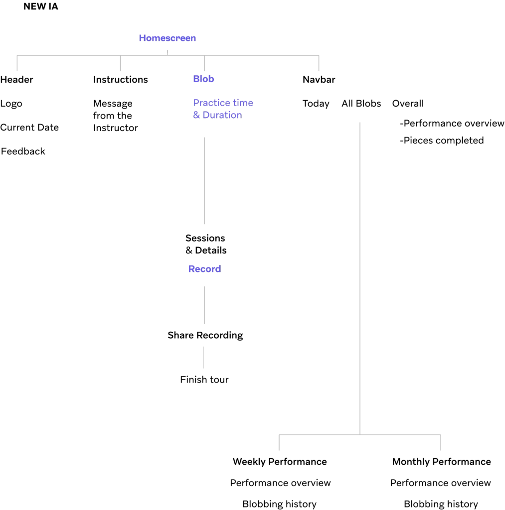
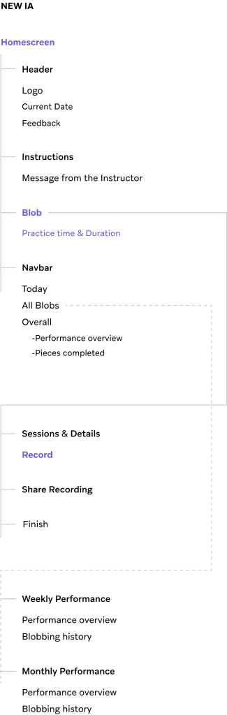
Reworking on the IA
The previous information architecture was poorly designed, with multiple options accessible from a single screen, leading to user confusion. Therefore, we decided to revamp the structure.
Expanding the workflows
Once the direction was decided by the client we decided to expand all the major workflows in the similar direction.
Setting up the visual direction
As we were on a tight deadline we decided to work on visual direction simultaneously while expanding all the workflows.
Considering that the app is intended for children, we chose to adopt a playful visual language to enhance engagement and entertainment. This involved incorporating high rounded corners, rounded fonts, and a vibrant color palette for the app.

We created a color palette from the brand colors. And we have used “Baloo 2” as the rounded characteristics of the font is closely matching with the tenets of the visual language.
Key Visual Workflows
After sharing the visual direction with the client, we decided to work on all the key workflows in the app.

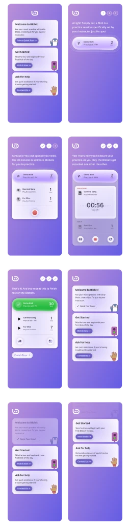
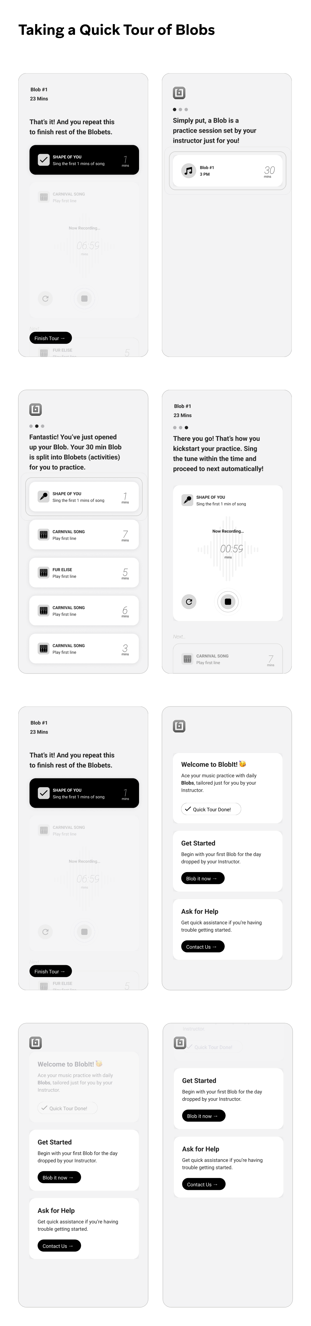
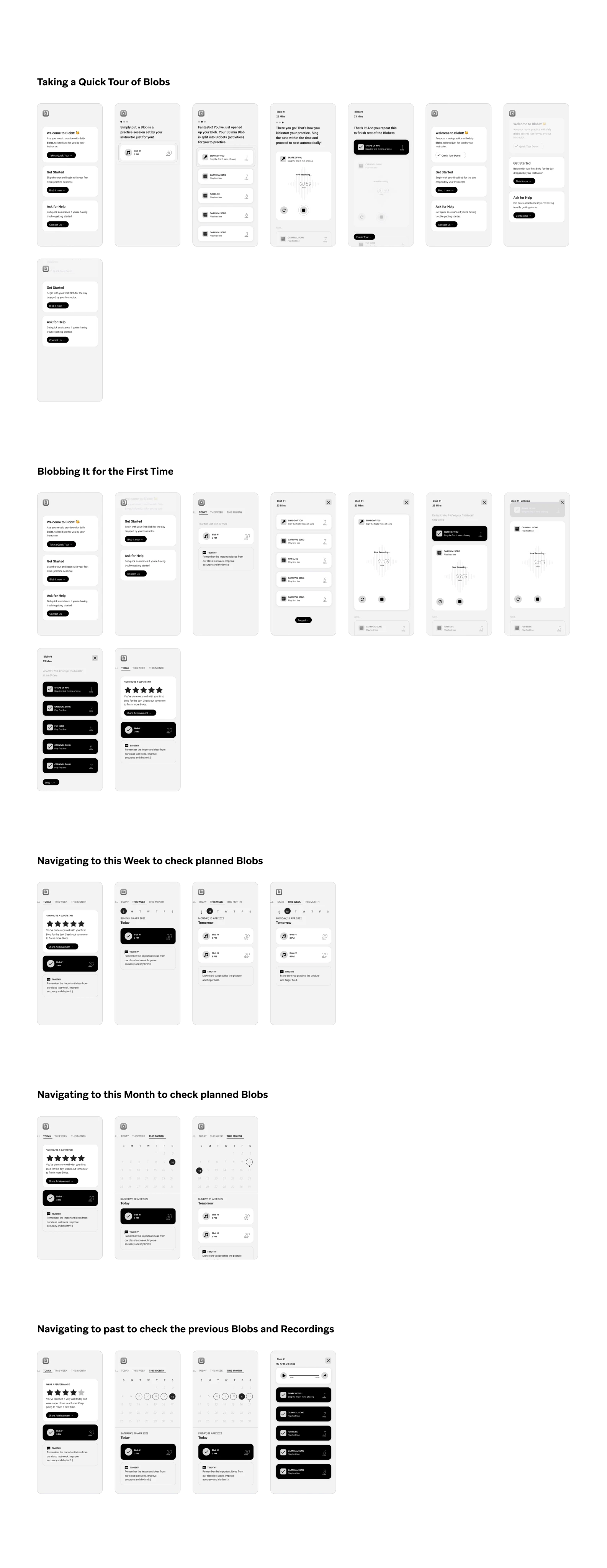
You may ask what’s a blob?
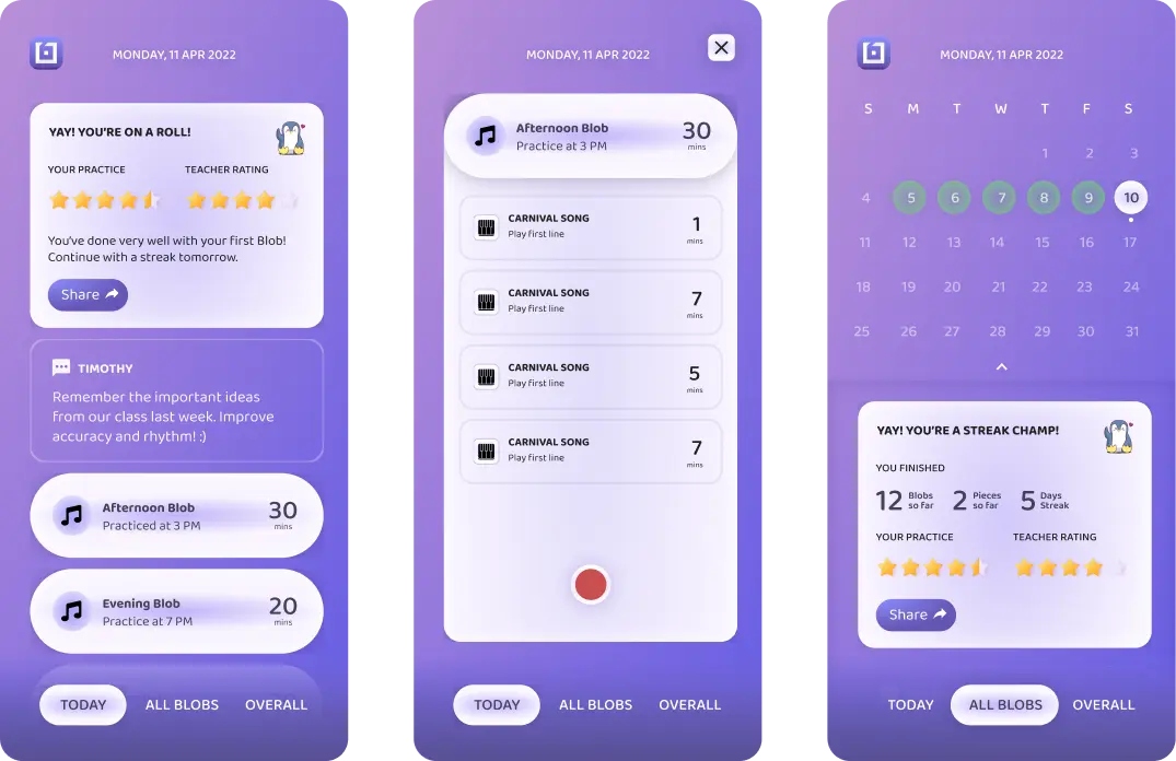
Blob is a practice session set by the instructor. The whole session is divided into small parts which are called as Blobets.
Why did we add a quick tour?
In the previous version, users faced a learning curve to understand how the app functions. Therefore, we decided to implement an interactive walkthrough to guide users through the app's features, eliminating the need for them to experiment with the app to determine their next steps.
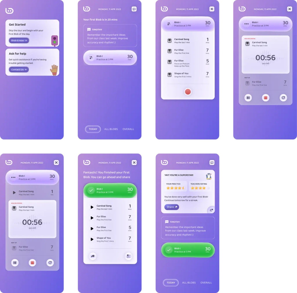
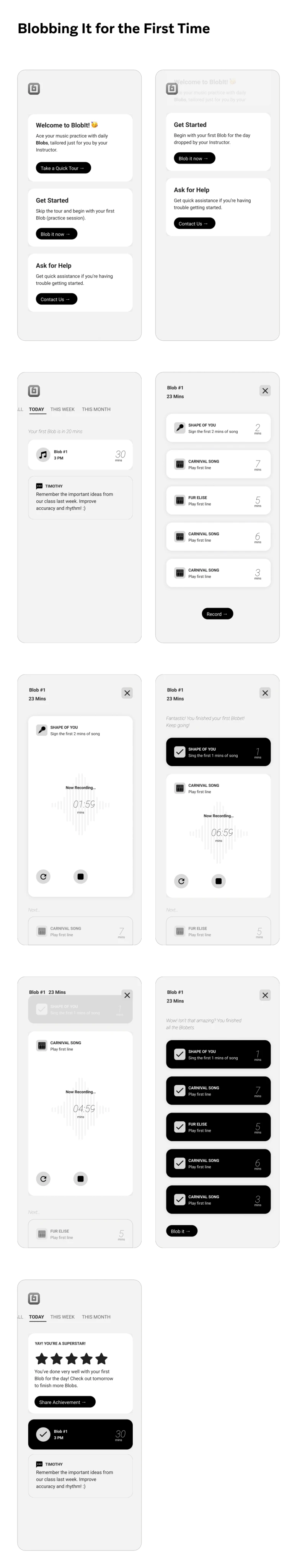
We wanted to create a playful worflow for the students to record their music sessions.
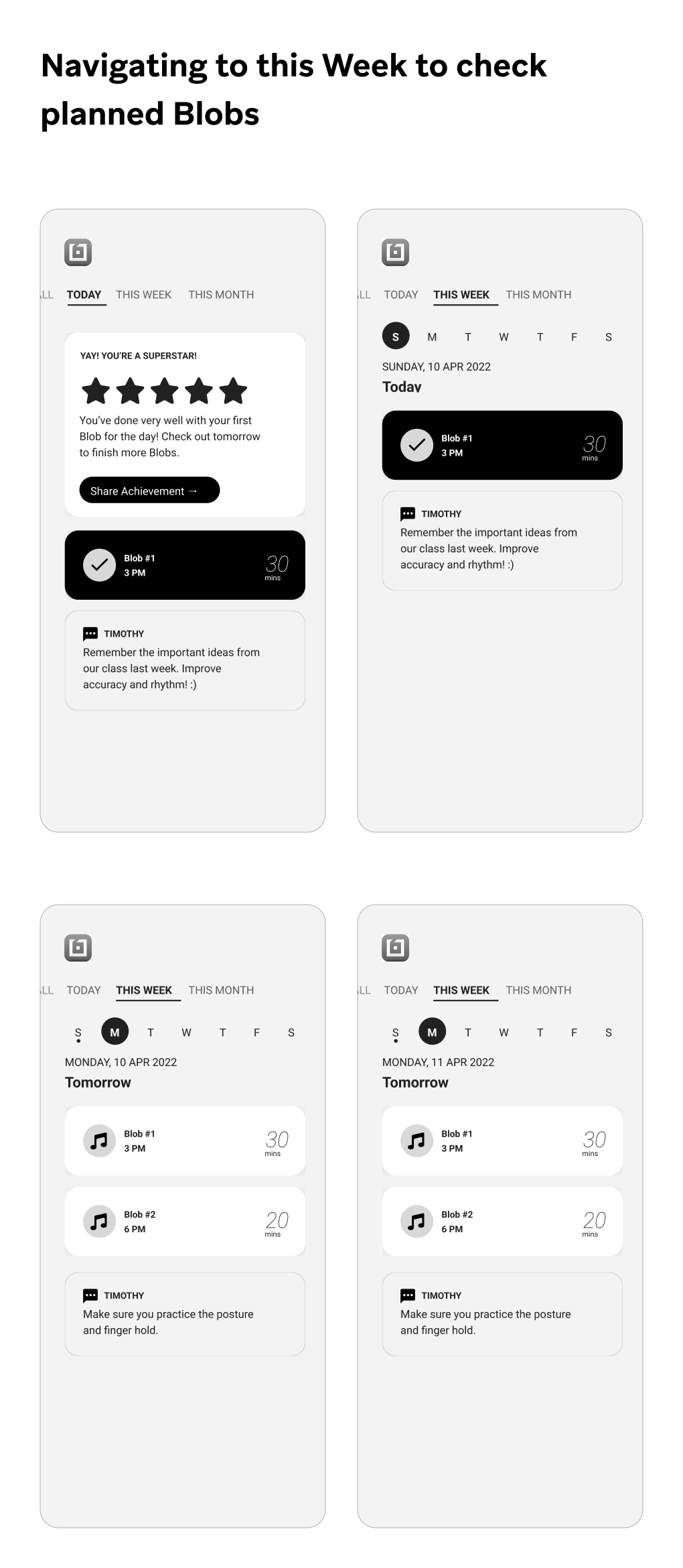
Navigating to this week to check planned Blobs
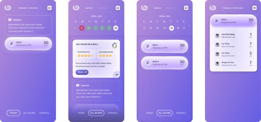
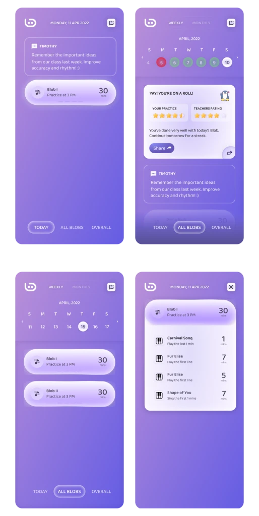
Navigating to this month to check planned Blobs

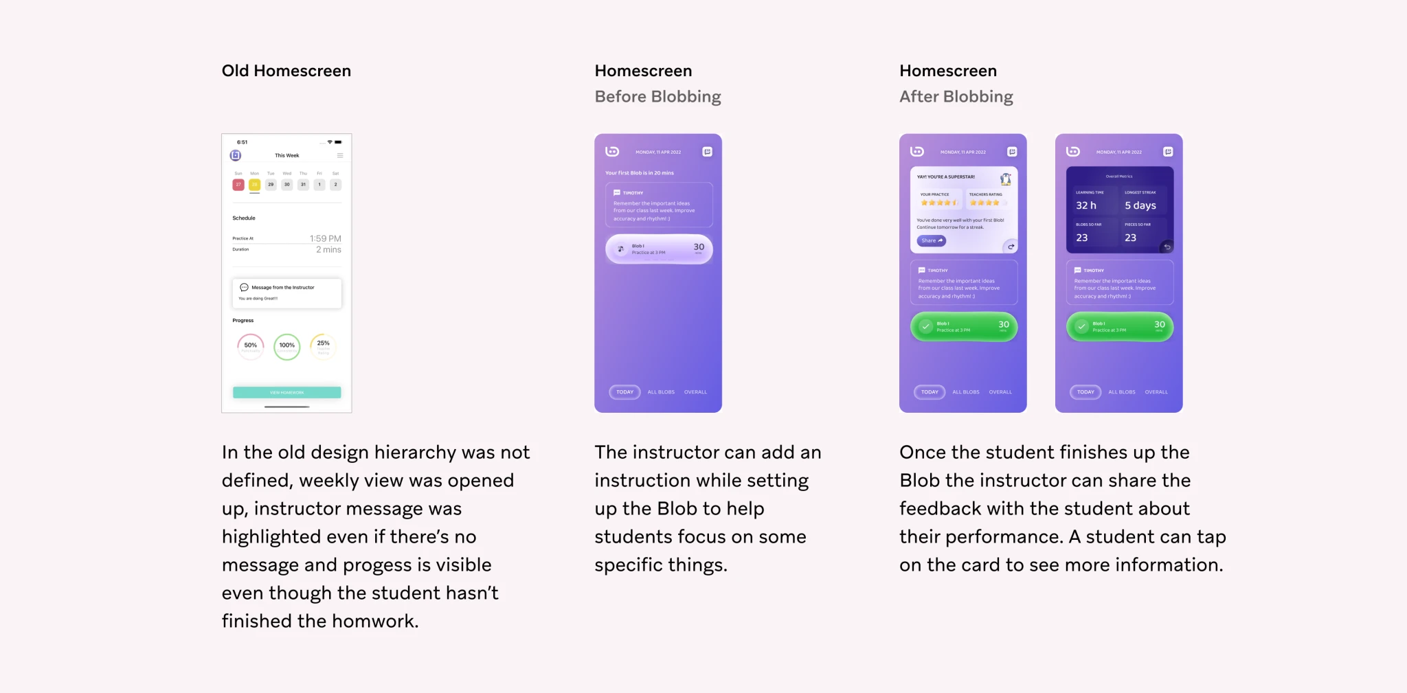
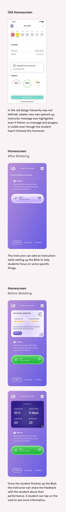
As I have previously mentioned, the hierarch was unclear in the old design, all workflows were linked from the homescreen. Hence in the new design we segregated the weekly and monthly workflows, so users don’t confuse that with the daily tasks.
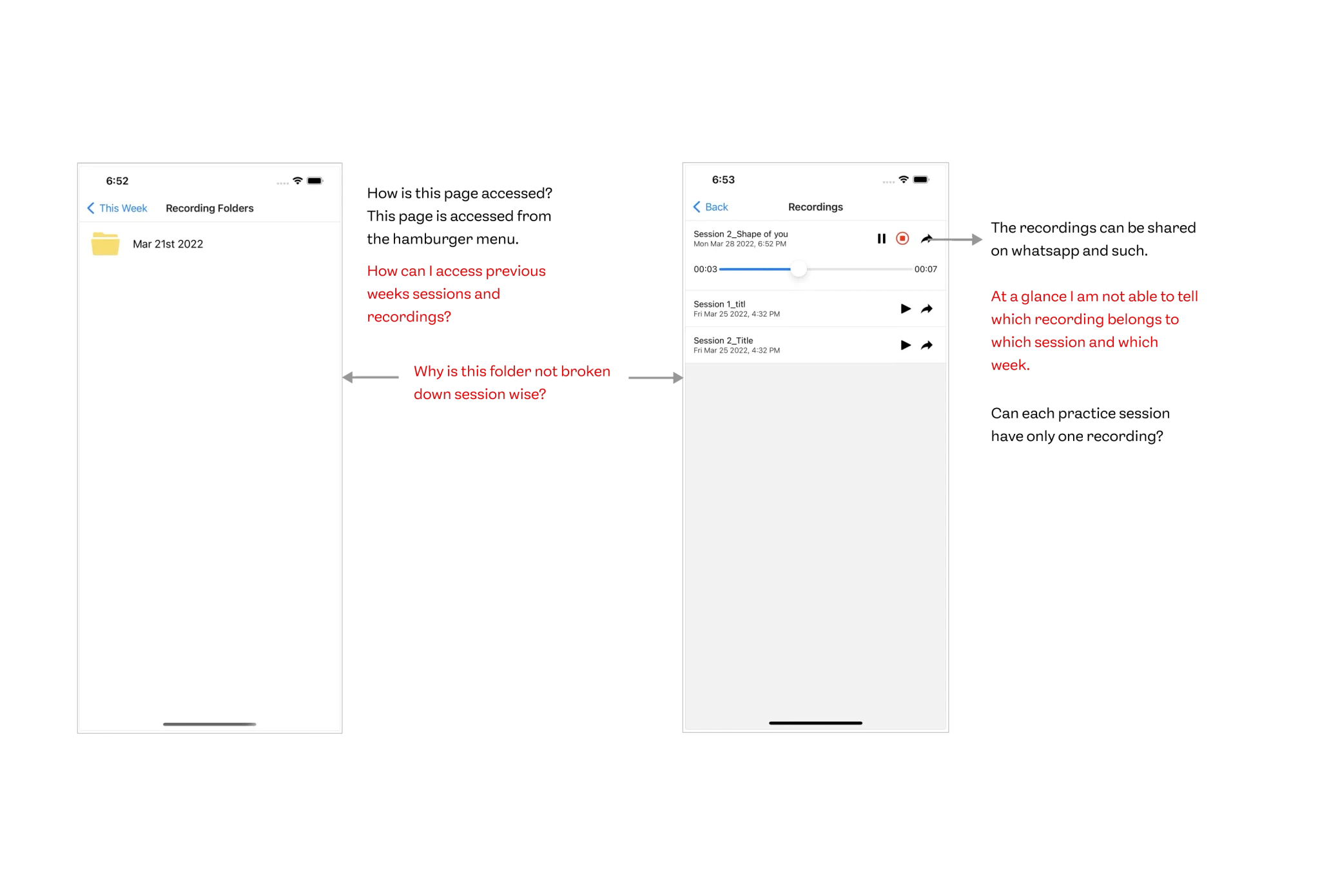
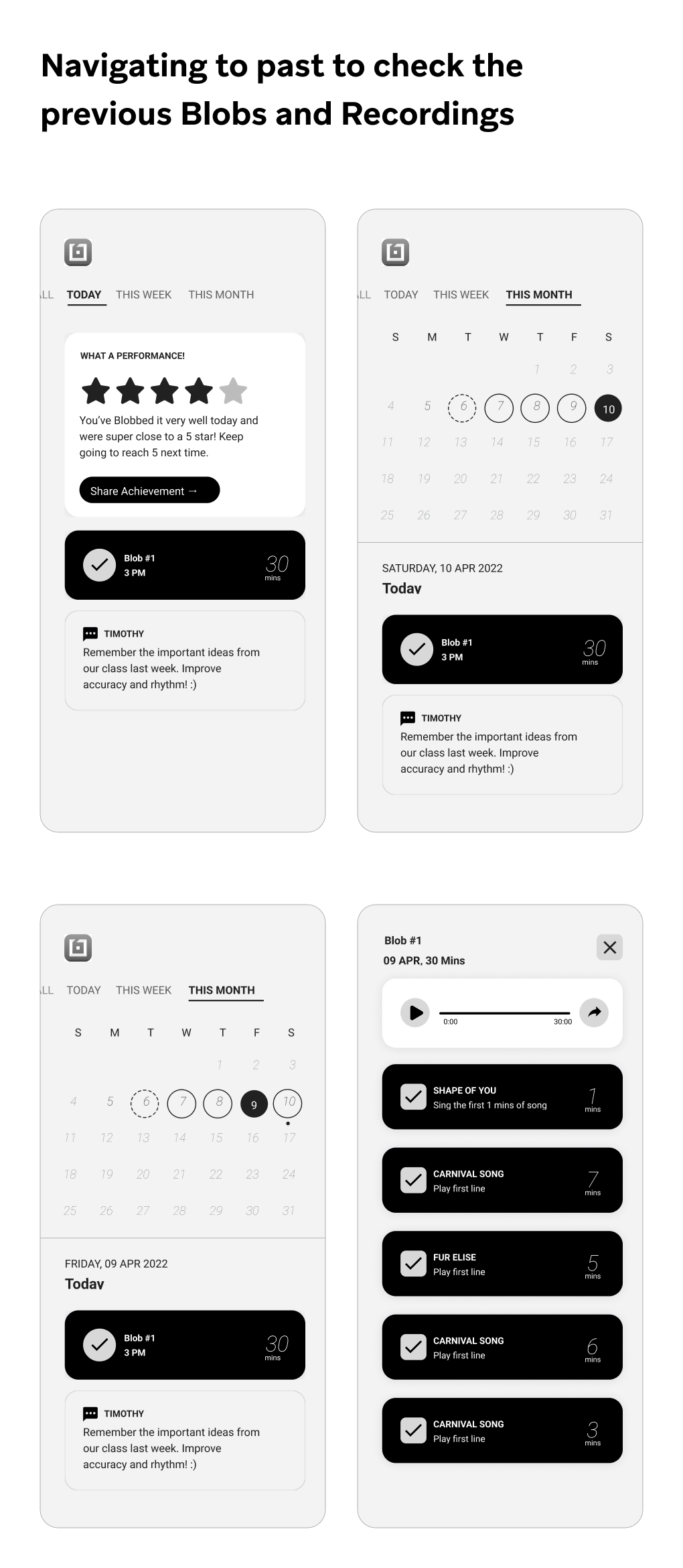
Previous Blobs & Recordings
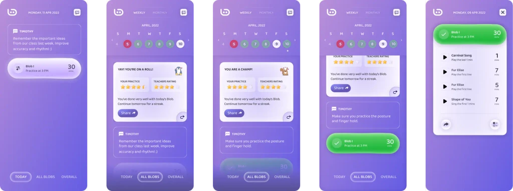
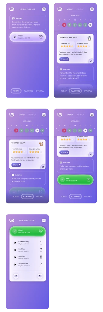
In the old design Blobs finished previously and their recording flow was disconnected which means you it had separate entry points. Hence in the new design we connected them, which made more sense. Also given an ability to share the recording on other platforms as well (which is something users were doing earlier with their instructors).
Prototype & Production Readiness
Once this was done, we moved to the prototyping stage where we created a detailed prototype. Apart from this we also moved on production readiness where we detailed out the nuances from all the screens.
The app was developed and is live on Apple App Store.